
Is the widget layout customizable?
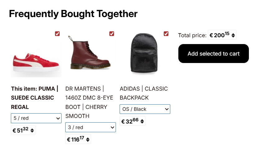
We have three available layouts for Frequently Bought Together. You can change them directly from the preferences pages, inside Visual styles → Layout. Those three layouts are:
- Original: The classic layout, trusted by merchants since 2017.

- Compact: A space-saving layout that displays the products in a single row.
- Stack: A vertical layout that places the purchase section below the bundle

Apart from that, mostly all the widget styles are fully configurable so things such as colors, fonts, sizes, or borders can be tuned.
This can be accomplished through these settings from the preferences page within the Visual styles → Widget.
Top and bottom separation

- With separation:

- Without separation:
There will not be any space on the top and bottom of the app.

Background color
As the name implies, this option is used to change the background color of the app.


The required color can be chosen in 3 ways.
- Leaving it transparent: Clicking on the none button in the color selector will leave the background color of the app transparent, which will help to match the app style with the background color of the store page.
- Using the Color slider: Clicking on the text box will open a color slider from which you can choose the required color.
- Entering the Color code: If you know the Hex Color Code # you can enter it in the text box directly. (Example: #FFFFFF for white color and #000000 for Black)
Maximum width
The 'Maximum Width' option is useful for controlling the width of the app widget. These values are in pixel number format.

So, according to the entered value, the app's width will be auto-adjusted.
Border & Border color
Border & Border color are used to enable a border for the app and its color.

Similarly to background color selection, the color can be selected as well.
